Christian Group Slams New Starbucks Logo
File this one under "Choose Your Battles": The Resistance, a national Christian group based in San Diego, has a problem with Starbucks' new, slightly-more-sexed-up cup design, featuring a bustier version of the familiar siren depicted on the coffee company's logo Resistance founder Mark Dice pointed to the label's "naked woman with her legs spread like a prostitute" and said Starbucks "might as well call themselves" -- wait for it -- "Slutbucks" .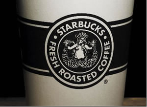
File this one under “Choose Your Battles”: The Resistance, a national Christian group based in San Diego, has a problem with Starbucks’ new, slightly-more-sexed-up cup design, featuring a bustier version of the familiar siren depicted on the coffee company’s logo. Resistance founder Mark Dice pointed to the label’s “naked woman … with her legs spread like a prostitute” and said Starbucks “might as well call themselves” — wait for it — “Slutbucks.”
There’s a small problem with this characterization, though: Since the “naked woman” is a mermaid, she doesn’t technically have legs to spread in the first place. Just sayin’.
Your support matters…StarTribune.com:
The image is a less-revealing throw-back version of what the chain used for many years starting when it first opened in Seattle in 1971. That original logo was resurrected in its Pacific Northwest outlets for a time in 2006 to mark the chain’s 35th anniversary.
[Company spokeswoman Bridget] Baker said the newly revived logo was “modified a bit [from the original] based on feedback” from Starbucks customers during its 2006 appearance.
“We feel it’s appropriate,” said Baker, who added that more attention should be paid to the good deeds that Starbucks does around the world as a corporation.
Independent journalism is under threat and overshadowed by heavily funded mainstream media.
You can help level the playing field. Become a member.
Your tax-deductible contribution keeps us digging beneath the headlines to give you thought-provoking, investigative reporting and analysis that unearths what's really happening- without compromise.
Give today to support our courageous, independent journalists.
 Middle East
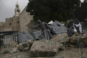
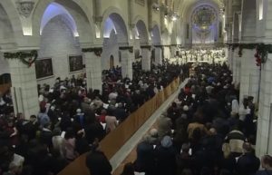
Hundreds of Gaza’s Christian families are either sheltering in a church or have fled south, marking Christmas only as another day of Israel’s deadly assault.
Middle East
Hundreds of Gaza’s Christian families are either sheltering in a church or have fled south, marking Christmas only as another day of Israel’s deadly assault.
 Belief & Religion
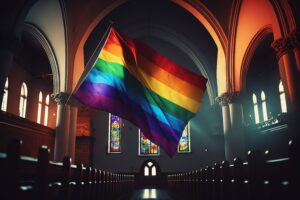
A new book explores the relationship among transgender youth, their parents, and conservative Christianity.
Belief & Religion
A new book explores the relationship among transgender youth, their parents, and conservative Christianity.
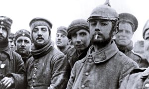 During World War I, men on both sides defied their leaders and respective nations, if only for a moment. Let it be a lesson in 2019.
 The celebrations capped the most successful year in history for Palestinian tourism, according to Tourism Minister Rula Maayah.
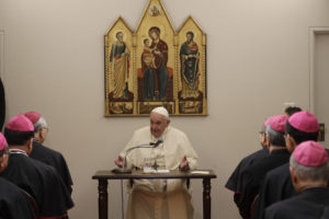 He goes further than any other pontiff, saying merely having atomic bombs is to be condemned, ahead of his visits to Nagasaki and Hiroshima.
You need to be a supporter to comment.
There are currently no responses to this article.
Be the first to respond.