Marketing Masculinity in an Age of Male Anxiety
What better way to jack up men's flagging sense of masculine prowess in these times of economic instability, with gender roles shifting by the minute, than by introducing a line of house paints that includes the colors "Bro Code" and "Zombie Apocalypse"? (more)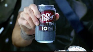
What better way to jack up men’s flagging sense of masculine prowess in these times of economic instability, with gender roles shifting by the minute, than by introducing a line of house paints that includes the colors “Bro Code” and “Zombie Apocalypse”?
Consumerism as cure-all is not a new idea, but as this Ottawa Citizen story suggests, marketers are finding creative new ways to make a play for men’s lunch money, even repurposing that staple of fabricated femininity, the diet soda, to appeal to male shoppers. Because nothing says “macho” like a syrupy, artificially sweetened low-calorie beverage. But as the article also notes, some scholarly culture watchers aren’t buying it. –KA
See for yourself: The ultra-manly Dr Pepper Ten commercial is posted under the excerpt below.
Ottawa Citizen:
Canada’s CIL Paints just launched its first “paint colours for men” collection, rebranding popular household hues with more manly names: Butterscotch Tempest, for example, becomes Beer Time; Juliet’s Potion is now Zombie Apocalypse; and Venetian Turquoise has been dubbed Bro Code.
Dr Pepper’s “It’s Not for Women” tag line is designed to get males to rethink diet pop, which market research suggested was perceived by that cohort as too girlie.
[…] Jeffrey Hall, a communications and gender scholar, notes that economic data shows the men hardest-hit by the recession were those in the lowest socioeconomic classes. In other words, not the ones with the disposable income to “worry about the type of skin care they’re using.”
DrPepper.com:
Your support matters…Independent journalism is under threat and overshadowed by heavily funded mainstream media.
You can help level the playing field. Become a member.
Your tax-deductible contribution keeps us digging beneath the headlines to give you thought-provoking, investigative reporting and analysis that unearths what's really happening- without compromise.
Give today to support our courageous, independent journalists.
 Politics
But MAGA world's feud with Swift is an excellent vehicle for observing the ever-quickening decay of American politics.
Politics
But MAGA world's feud with Swift is an excellent vehicle for observing the ever-quickening decay of American politics.
 Environment
A move towards a sustainable, less disposable economy that eschews luxury will address inequity and push us towards a more habitable future.
Environment
A move towards a sustainable, less disposable economy that eschews luxury will address inequity and push us towards a more habitable future.
 Editorial Cartoons
 Editorial Cartoons
 Editorial Cartoons
 Freecycle plans to add a lending and borrowing tool to encourage people to share with friends and neighbors.
You need to be a supporter to comment.
There are currently no responses to this article.
Be the first to respond.