
The NYT Charts Student Debt Across the Nation
With data collected by the Institute for College Access and Success, editors at The New York Times created an interactive graph showing annual tuition and fee costs and average graduate debt for a number of American universities.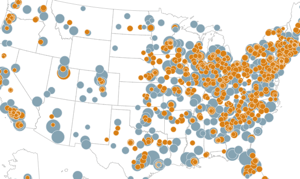
With data collected by the Institute for College Access and Success, editors at The New York Times created an interactive graph showing annual tuition and fee costs and average graduate debt for a number of American universities.
The graphic provides a map of universities and categorizes colleges by type of ownership, enrollment size, graduation rate, share of graduates with debt and athletic conference and shows data from 2004 through 2010.
An in-depth article surveying the broader social meaning of the data shown in the graph, including its significance for students, their families and the American economy, can be read here. –ARK
Your support matters…Independent journalism is under threat and overshadowed by heavily funded mainstream media.
You can help level the playing field. Become a member.
Your tax-deductible contribution keeps us digging beneath the headlines to give you thought-provoking, investigative reporting and analysis that unearths what's really happening- without compromise.
Give today to support our courageous, independent journalists.
 Asia Pacific
Biden envoy, Joseph Yun, helped shape defensive policy for the Pacific islands while consulting for a private firm that represents a massive conflict of interest.
Asia Pacific
Biden envoy, Joseph Yun, helped shape defensive policy for the Pacific islands while consulting for a private firm that represents a massive conflict of interest.
 Middle East
Despite record heat waves and biblical floods, Middle Eastern leaders continue to do as little as possible to combat the reality of climate change.
Middle East
Despite record heat waves and biblical floods, Middle Eastern leaders continue to do as little as possible to combat the reality of climate change.
 Social Justice
For the U.S. to truly address this crisis, we must transform our approach and recognize that housing is a fundamental human right, not a commodity.
Social Justice
For the U.S. to truly address this crisis, we must transform our approach and recognize that housing is a fundamental human right, not a commodity.
 TD Column
Cancer-causing PFAS are in 45% of our tap water. New government regulations won't fix that.
TD Column
Cancer-causing PFAS are in 45% of our tap water. New government regulations won't fix that.
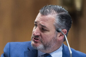 Media
The Texas senator’s iHeartMedia deal, which sent over $600,000 to an aligned super PAC, may be illegal—or it exploits a new loophole.
Media
The Texas senator’s iHeartMedia deal, which sent over $600,000 to an aligned super PAC, may be illegal—or it exploits a new loophole.
 Wounds of War
Two decades after being brutally tortured, three Iraqis have brought a lawsuit against the U.S. military contractors responsible.
Wounds of War
Two decades after being brutally tortured, three Iraqis have brought a lawsuit against the U.S. military contractors responsible.


You need to be a supporter to comment.
There are currently no responses to this article.
Be the first to respond.