See the Racial Dot Map
A dot for every person. That's what demographic researcher Dustin Cable of the University of Virginia's Weldon Cooper Center for Public Service did with census data to show how population in the United States breaks down by race.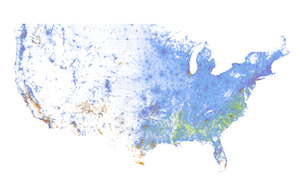
A dot for every person. That’s what demographic researcher Dustin Cable of the University of Virginia’s Weldon Cooper Center for Public Service did with census data to show how population in the United States breaks down by race.
By the look of the map, which is zoomable to the city level, America remains overwhelmingly white. Blacks, Asians and Hispanics appear to be largely clustered around cities. Zoomed out, the East and the Midwest look populous, with density patterns broken up by mountain ranges. The West seems largely empty. All in all, the map counts 308,745,538 dots, one for each person recorded as residing in the United States at the place they were counted in the 2010 census.
The accompanying report says:
Each of the 308 million dots are smaller than a pixel on your computer screen at most zoom levels. Therefore, the “smudges” you see at the national and regional levels are actually aggregations of many individual dots. The dots themselves are only resolvable at the city and neighborhood zoom levels.
Each dot on the map is also color-coded by race and ethnicity. Whites are coded as blue; African-Americans, green; Asians, red; Hispanics, orange; and all other racial categories are coded as brown.
See the map in action here.
— Posted by Alexander Reed Kelly.
Your support matters…Independent journalism is under threat and overshadowed by heavily funded mainstream media.
You can help level the playing field. Become a member.
Your tax-deductible contribution keeps us digging beneath the headlines to give you thought-provoking, investigative reporting and analysis that unearths what's really happening- without compromise.
Give today to support our courageous, independent journalists.
 TD Column
Does South Carolina’s updated voting map violate the 14th and 15th Amendments?
TD Column
Does South Carolina’s updated voting map violate the 14th and 15th Amendments?
 Education
The Real Education and Access for Healthy Youth Act incentivizes states nationwide to provide inclusive, trauma-informed sex education in schools.
Education
The Real Education and Access for Healthy Youth Act incentivizes states nationwide to provide inclusive, trauma-informed sex education in schools.
 Arts & Culture
Visual investigations at the intersection of climate change and global migration.
Arts & Culture
Visual investigations at the intersection of climate change and global migration.
 TD Original
The teenage jazz musician learned the American history his state doesn't want to teach him.
TD Original
The teenage jazz musician learned the American history his state doesn't want to teach him.
 Race
Five key findings from a Pew Research Center survey.
Race
Five key findings from a Pew Research Center survey.
 Race
How U.S. history textbooks and prominent American universities justified slavery, perpetuated racial stereotypes and promoted white supremacy.
Race
How U.S. history textbooks and prominent American universities justified slavery, perpetuated racial stereotypes and promoted white supremacy.
You need to be a supporter to comment.
There are currently no responses to this article.
Be the first to respond.